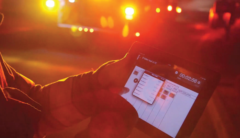
We’re a long way from the black and white images of cops with their feet up on the desk and firemen playing cribbage in Fire Station USA. Since 9/11 and the dawn of the iPad, emergency services is becoming increasingly armed with the latest and most intuitive technological enhancements from the consumer space to track, measure, and analyze.
I am currently assigned as a Fire Captain/Safety Officer in a large Bay Area Department. I respond to every significant incident and assist the Incident Commander with Accountability; keeping track of personnel during each emergency.

Failure to accurately account for our personnel during fires and other emergencies contributes to twenty or thirty firefighter deaths and countless injuries every year. Poor accountability contributes to twenty or thirty firefighter lives and countless injuries every year. This is why we created Tablet Command: there has never been an intuitive technology available to get this job done correctly. Thus we’ve been forced to wing it with disparate, siloed, analog solutions.
Legacy hardware and software offer address delivery and navigation but here’s the BIG difference: BIG BUTTONS and SPEED.
I love iOS intuitiveness. And big buttons is one of the reasons I love the user experience of Tablet Command. With Tablet Command, I can easily locate the call I’m dispatched to, and with the touch of a finger, get an immediate description of that call. And navigation? And navigation? Just tap that big button that says... wait for it..... “Navigate”. Go figure- I get turn by turn directions.
When I arrive on scene, all of the other responding units auto-populate onto my scene-map and I track their progress almost as if I’m playing a strategy game. Now all we need to do is install that status button and we’ll eliminate the need and the cost of the ruggedized legacy devices that cause pain and inefficiency during a critical part of the call- the response.
Tacticians and strategists can’t be expected to wrestle with technology during emergencies. The technology must be elegant, seamless, and intuitive so that it augments and fits in with the Incident Action Plan.
Kudos to our engineers for creating a kick-ass and very easy-to-use interface. The work they’re doing is helping us win on the fireground and it’s helping me keep our personnel safer during emergencies.
